


Colour Psychology: How Paint Shades Influence Mood
Colour Psychology: How Paint Shades Influence Mood with Colour Supplies
When decorating your home, colour is far more than just a design choice—it has the power to affect how you feel, think, and live in a space. Whether you're creating a calming sanctuary or an energising workspace, understanding colour psychology can help you choose the perfect shades to match the mood you want to create.
At Colour Supplies, we believe that colour isn't just a finishing touch—it's the foundation of your home’s personality. Let’s explore how paint colours influence mood and how you can use this knowledge to make informed, confident design decisions.
The Basics of Colour Psychology
Colour psychology is the study of how different colours affect human emotion and behaviour. While individual reactions can vary due to personal experiences or cultural background, certain colour associations are widely recognised and can serve as a guide when decorating your home.
Whether you want to create an atmosphere of calmness and peace, one that will help you focus, or an atmosphere that will have an energetic impact, in this guide we'll explore the different meanings behind colours, as well as some combinations you can use for an even bigger impact.
So let's dive deep into Colour Psychology: How Paint Shades Influence Mood and how you can use this to help pick out the right colour for your decorating needs.
Cool Colours: Calming & Serene
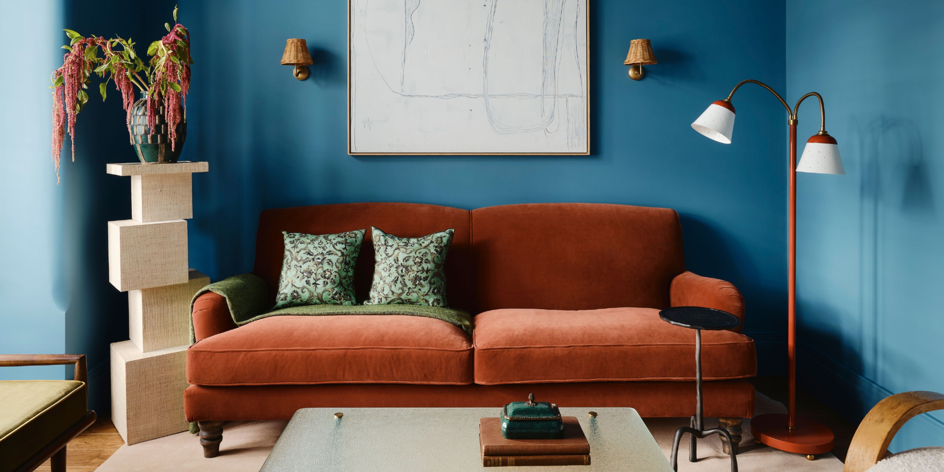
Cool tones like blues, greens, and soft purples create feelings of calm, restfulness, and tranquillity. These colours are ideal for bedrooms, bathrooms, or any space where you want to unwind and relax. Lighter shades in this family make smaller rooms feel more open and airy.
- Blue: Known to lower heart rate and promote peace, soft blues are perfect for restful spaces. Try a dusty blue in the bedroom or a navy blue in a cosy reading nook.
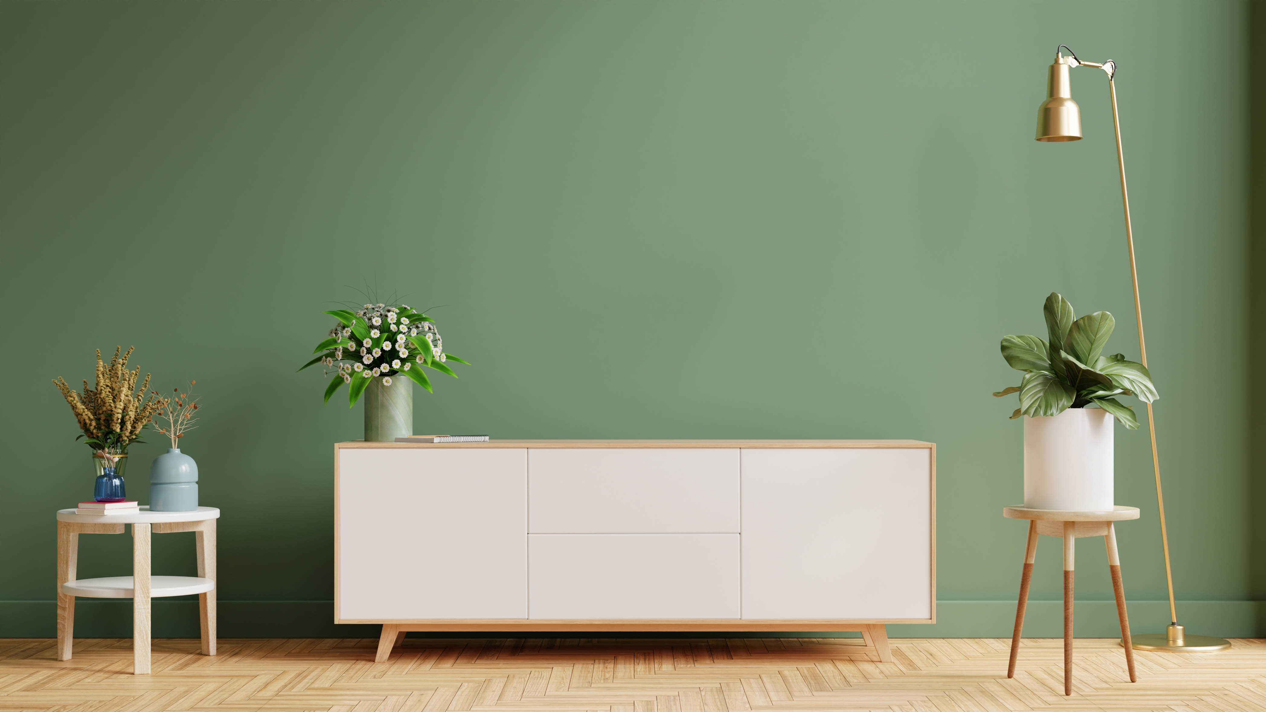
- Green: Associated with nature and renewal, green brings balance and harmony. Sage and olive tones work beautifully in living rooms or home offices.
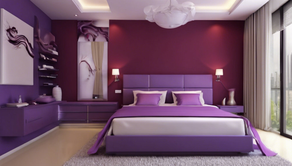
- Lavender & Lilac: These gentle purples blend the calmness of blue with the warmth of red, offering a peaceful but slightly playful vibe.
Warm Colours: Energising & Inviting
Warm hues like reds, oranges, and yellows can evoke energy, creativity, and sociability. These colours are great for communal areas such as kitchens, dining rooms, or hallways. You can use warmer tones in rooms where you entertain or want to spark creativity and interaction, as those colours can create an atmosphere that fosters those types of environments.
- Red: A powerful and passionate colour, red can stimulate appetite and conversation—making it a bold choice for dining rooms. Use it as an accent if you're unsure about full walls.
- Orange: Vibrant and friendly, orange works well in family rooms or playrooms. It adds a dynamic touch without being too overwhelming.
- Yellow: Often associated with happiness and sunshine, yellow can bring warmth and cheer to kitchens or entryways.
Neutrals: Versatile & Sophisticated
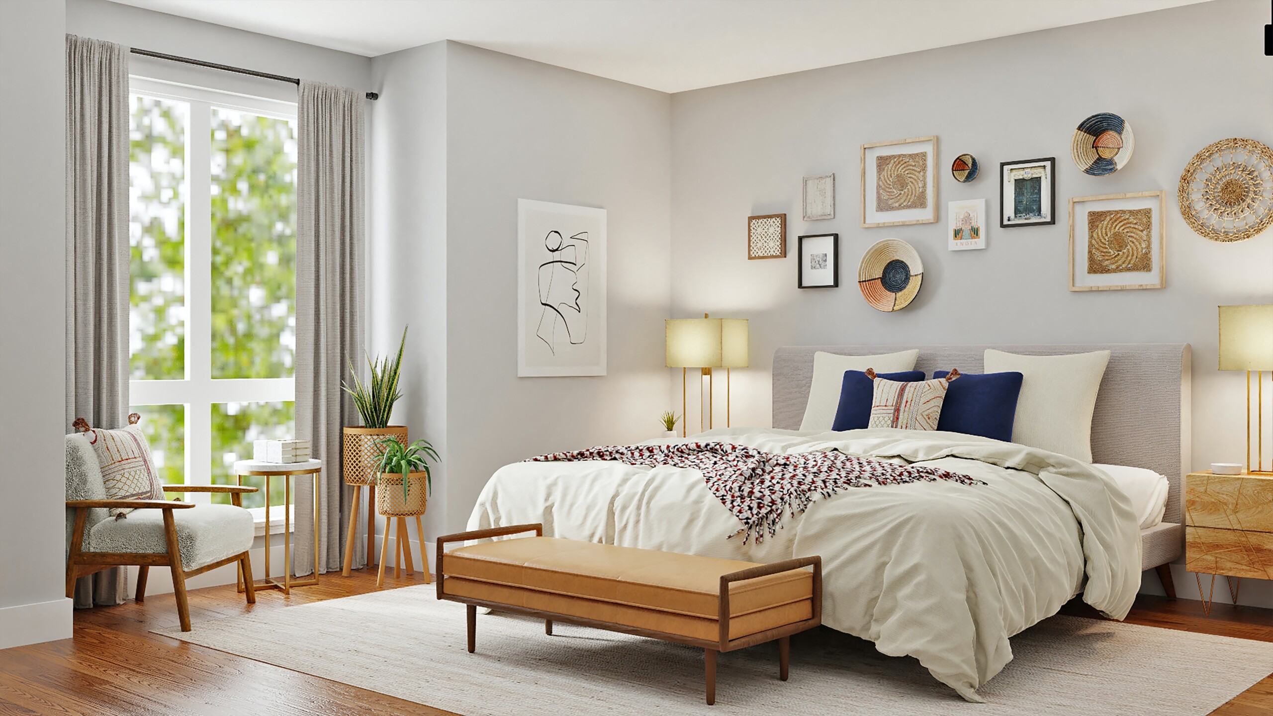
Neutrals—like beige, greys, whites, and taupes—provide a timeless backdrop that complements every design style. While they may seem simple, these shades can strongly influence the mood of a room through undertones and lighting. Layer neutral tones with different textures (wood, linen, metal) to avoid a flat or sterile feel.
- White & Off-white: Clean and minimal, whites evoke a sense of purity and space. Great for making rooms feel larger or highlighting architectural details.
- Grey: Calm and refined, greys can be cool or warm depending on undertones. Ideal for creating a modern or industrial-chic aesthetic.
- Beige & Taupe: These earth-toned neutrals feel grounding and cosy, especially when paired with natural textures and warm lighting.
Accent Colours & Their Emotional Impact
Even in a neutral room, accent colours can dramatically shift the atmosphere. Use painted furniture, trims, or even front doors to introduce bold accent colours in a controlled way. Here are some emotional triggers to consider when choosing your accent shades.
- Pink: Nurturing, romantic, and soft—great for bedrooms or children's rooms.
- Turquoise/Teal: Invigorating but calming—ideal for bathrooms or creative spaces.
- Black: Adds depth, drama, and sophistication—best used sparingly to ground a space.
Final Thoughts
Colour Psychology: How Paint Shades Influence Mood
When it comes to choosing paint colours, don’t just follow trends—follow your feelings. Consider how you want to feel in a room and choose shades that support that mood. With a little understanding of colour psychology, your home can not only look beautiful but feel just right.
Need help choosing the perfect shade? Visit your local Colour Supplies store or browse our paint selection online to get expert advice and inspiration.
Related Articles

New, bigger hardware departments
From DIY to the Trade, if you need hardware call in to Colour Supplies where you'll now find an even bigger and better range to choose from.
There's more to Dulux Colour of the Year 2025 than just one paint colour
From a team of experts based around the world, to a paint you can put on your walls - how does Dulux decide on the Colour of the Year, and why? Read on to find out the fascinating journey to creating the Dulux COTY 2025.