


Beginner’s Guide to Colour Matching: Tricks from Artists and Crafters
Beginner’s Guide to Colour Matching
Choosing the right colour is one thing—matching it perfectly is another. Whether you're repainting a room, upcycling old furniture, or picking out accessories to complement a feature wall, colour matching is a skill that anyone can master with the right guidance.
In this beginner’s guide to colour matching, we’ll share simple but powerful tricks that artists and crafters use to match colours by eye, with tools, and through practical experimentation—no fancy tech required.
Why Colour Matching Matters
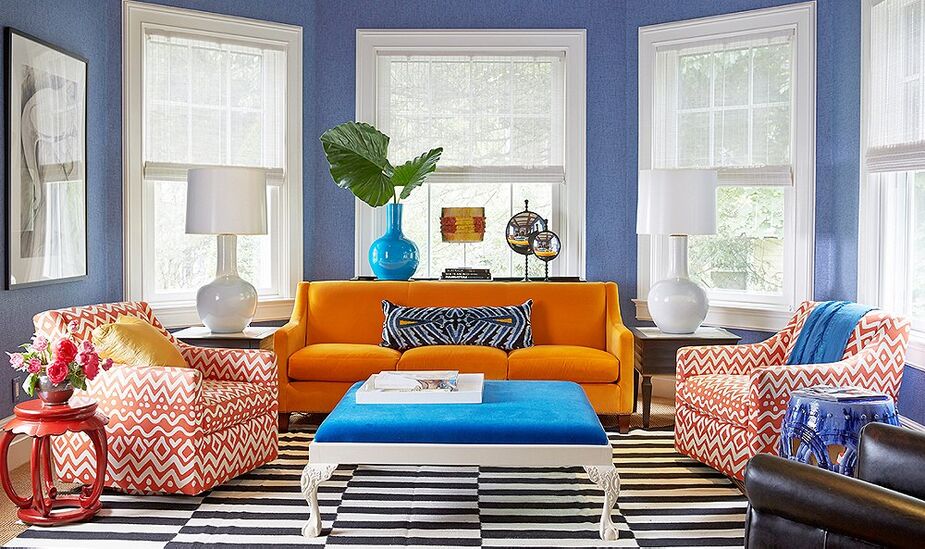
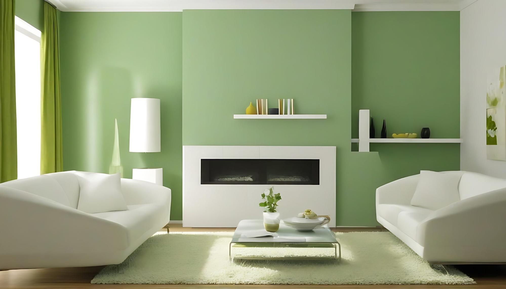
A colour mismatch can throw off your entire décor. That “almost right” beige might clash with your carpet or that sky blue may look jarringly off under warm lighting.
Perfect colour matching helps:
- Create harmony between old and new elements in a room
- Maintain consistency when touching up walls or furniture
- Elevate your overall design, making everything feel intentional
For professional painters and DIY decorators alike, learning to match colours by sight or tool can save time, money, and frustration.
The Core Concepts: Hue, Value, and Saturation
Before diving into matching techniques, it's helpful to understand how colours are defined. Artists often think in three key dimensions:
- Hue: The basic colour (e.g., red, blue, green).
- Value: How light or dark the colour appears.
- Saturation: The intensity or vividness of a colour.
When a colour match feels “off,” it's often the value or saturation that’s wrong—not the hue. Pay close attention to how bright or dull a colour appears, especially under different lighting conditions.
Everyday Tools That Make Matching Easier
Even without pro-level gear, there are some accessible tools that can seriously boost your accuracy.
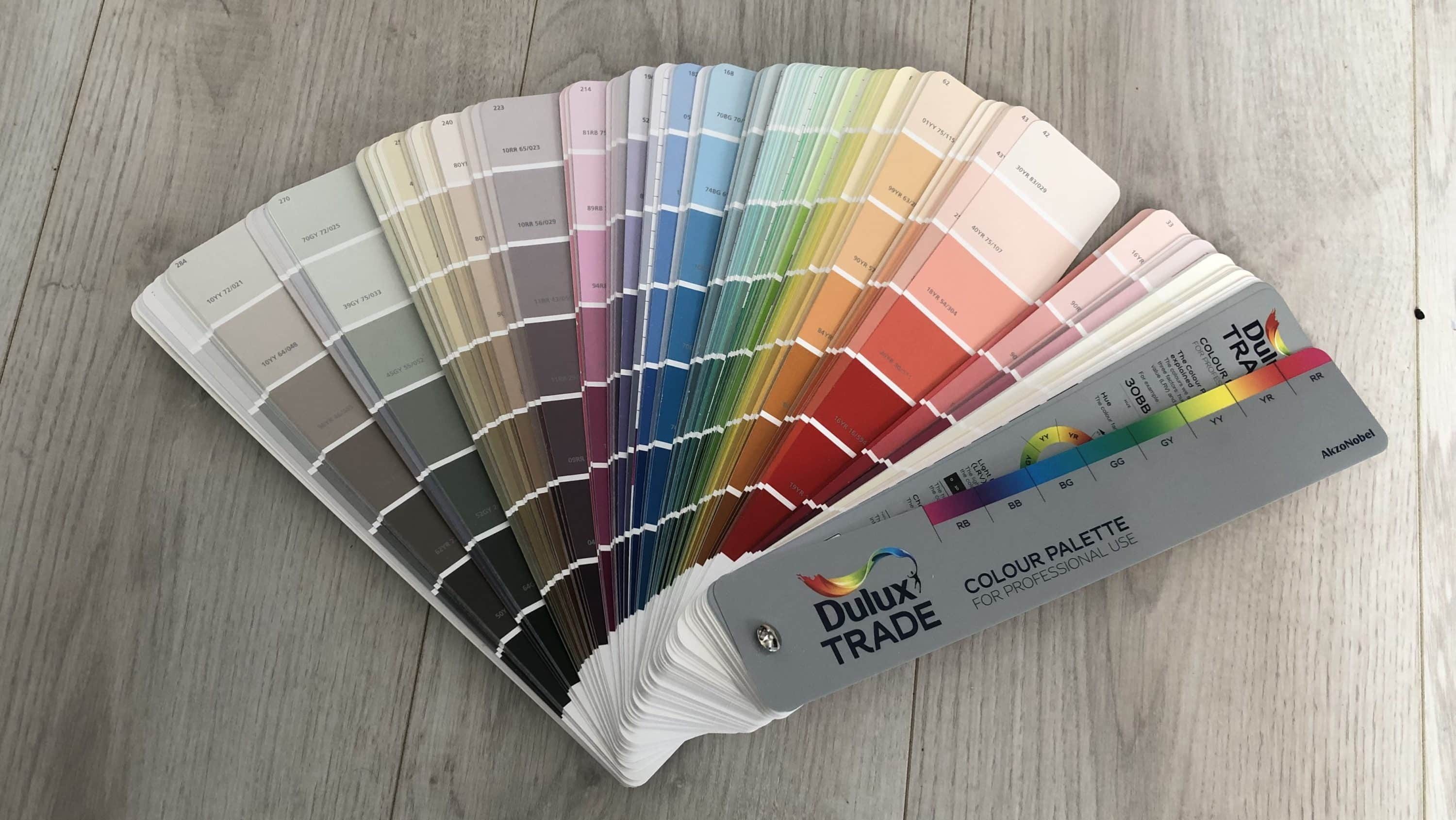
- Fan Decks & Colour Cards
Available at Colour Supplies, these are essential for comparing hues and undertones in-store or at home. - Paint Sample Pots
Don’t trust just the swatch—test it on your actual surface before committing. - Digital Colour Matching Apps
Apps like Dulux Visualizer or ColorSnap let you snap a photo and find the closest shade match. - Natural Light
Always check your colour samples in daylight (not just under artificial bulbs), as it greatly affects perception.
Common Colour Matching Mistakes
Even pros make mistakes. Here’s what to watch out for:
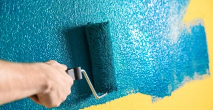
- Forgetting about finish
A matt paint and a satin one may look like different colours—even if they’re technically the same shade. - Matching in poor lighting
Check your samples in daylight near a window. - Relying only on your screen
Digital displays distort colour. Always get a physical swatch or sample pot - Skipping the dry test
Wet paint always looks darker. Wait for it to dry before judging the final look.
When to Use a Professional Colour Matching Service
Sometimes, you need a perfect match—especially if you're:
- Touching up paint on older walls
- Matching trim, skirting boards, or fitted furniture
- Restoring painted items with faded or discontinued colours
Colour Supplies offers expert paint mixing services, where staff can scan a sample and recreate a near-perfect match from thousands of options.
Final Thoughts
Beginner’s Guide to Colour Matching
Colour matching doesn’t need to be intimidating. With a little practice and a few go-to tricks, you’ll be making confident, informed choices like a pro.
Whether you're bringing new life to a beloved chair or ensuring your feature wall pops in just the right way, remember: a good match makes all the difference.
Related Articles
Why Is My Paint Not Sticking to the Wall — and How Do I Fix It?
There’s nothing more frustrating than putting time and effort into painting, only to see it peel, bubble, or slide right off the wall. If your paint isn’t sticking, you’re not alone — this is one of the most common DIY decorating issues. In this guide, we’ll walk you through why paint sometimes doesn’t adhere properly, how to fix it, and most importantly, how to prevent it happening again. Let’s get your walls looking as fresh and flawless as they should be!
Tiling Supplies
We have a large specialist Tiling Centre in Wrexham, and also smaller tiling sections at both our Oswestry and Whitchurch Home and Garden Stores.